
The Anatomy Of A (Bad) Yellow Pages Ad
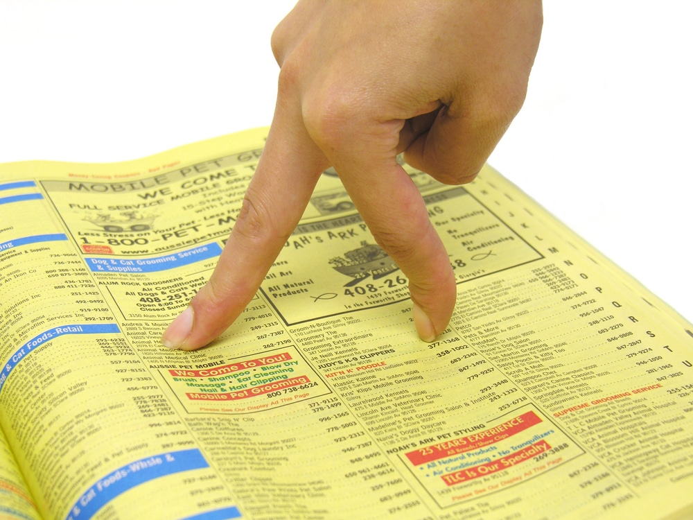
The Yellow Pages. Remember those? I had a sense of nostalgia yesterday in the Power household as one came crashing through my letterbox. Well, I say ‘crashing through’ but the very fact that it even fits through my letterbox now tells a story in itself.
It’s about a third of the thickness which I remember it being from when I was a little girl, and I doubt that they’ll be making any more of the adverts with the little boy using it as a stool for his first kiss under the mistletoe! (You remember that ad, right? If not, Google it).
With the rise of the internet and the digital age of course it should come as no surprise that the traditional Yellow Pages is getting thinner. Less people are advertising in them and quite frankly less people are reading them too. I mean, if you need a shiny new kitchen are you going to dig out the Yellow Pages or simply whip out the trusty iPhone and Google away. I know which I do.
But that said, it doesn’t mean that Yellow Pages ads don’t work, or that they can’t necessarily work for you. With the depletion of their popularity there are almost certainly some bargains to be had near to print time, even if it is only to complement your advert on the online version, yell.com.

Getting thinner by the year
Here is where I have a problem though. Even if your ad space is free, you should be making the very most of it. Even if it is only half an inch high and an inch wide you must make effective use of the space. And whilst I thumbed the Bournemouth edition yesterday one thing was clear; company after company were submitting some quite frankly shocking advertisements.
Why I Like Them Ugly!
Now I’m not saying some of them aren’t nicely designed. They are. I should imagine there are some designers somewhere sitting back quietly pleased with their work. But give me an ugly ad which works any day of the week!
Just think about that last sentence for a minute because I don’t think enough people do. When it comes to advertisements (or even entire websites) then it’s better to be ugly and effective than it is pretty and useless. The purpose of the majority of the adverts in the Yellow Pages is to make you pick up the telephone and call the company. If the advert doesn’t make you do that then, quite simply, it has failed. However pretty it looked.
Now I’m not saying that you shouldn’t have a well designed and good looking advert (or website, even), I’m just saying that it isn’t the most important thing. Whatever any designer might tell you contrary to that!
So I thought that it might be useful to show you what I mean further with an illustration. So I scanned the publication again and wasn’t short of examples! So below you’ll see an advert from the current edition and why I think the advert could have been much better.
I’ve blurred the name and number of the company as to not call any offence, but if you spot it as yours then feel free to follow my advice for next year!

Not the greatest ad ever written
So then, a few points to note on where this falls down, and where you can make sure you don’t make the same mistakes. To be clear also, many of these rules apply to any form of advertising – printed or otherwise.
What Is Wrong With This Advert
1. At the top of the advert is a huge logo. This whole space simply is the company name and nothing else. The most important part of the advert and all they have to shout about is their own name. Oh, the vanity!
This area should have a compelling headline, something which makes me take a second look and makes them stand out from all the other adverts around them.
2. They have chosen to add not one, but four fax numbers on this advert. Fax numbers?! This is the twenty-first century, darling! Out with the fax number and in with an email address please! Again, this is prime advertising real estate here and they fill it almost entirely with contact details. Sadly no mention of why I might want to contact them however!
3. They have managed to include their website, thankfully, however they are also making the error of sending traffic to the same place as everyone else. How can they measure the effectiveness of the ad?
Here’s what I would have recommended for them and done differently.
What I Would Do Differently
An attention grabbing headline. You have to stand out – especially in a book where everyone around you is your direct competition! Make me look twice by any means necessary. Ideally with a headline which compels me to keep reading.
Next you want to entice the customer by explaining what you can do for them. There are lots of ways to do this, but simply listing the services you offer isn’t good enough. You want to be tapping in to the problems the reader might be facing and then explaining how you can solve them. The sad reality is the reader doesn’t care about you, only themselves. Talk in terms of their problems and the benefits you can deliver to them.
You should also be giving a reason to get in touch. A special offer wouldn’t go amiss. A special offer that I simply couldn’t refuse would be even better.
You must have a clear and simple call to action. One telephone number to call or website to visit is better than five. Five confuses people. One is clear, simple and concise.
And for extra brownie points sending them to a specific and measurable website (or a dedicated telephone number) is even better. That way you’ll know exactly how many people have responded to your advert and whether or not you should consider running it again the following year.
What do you think? Would you have called the company in this ad? Or just whipped the fax machine out of the loft…